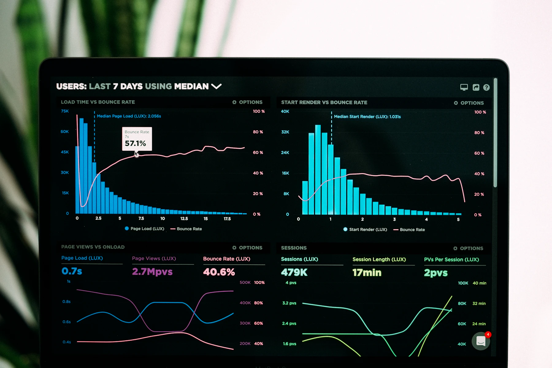
The module on annotation layers in Workforce Dashboard Fluency forced me to cut six vanity KPIs. Our Friday pack is thinner — and people actually open it.
LogicStack Tools
Workforce numbers that hold up in Monday standups.
We teach analysts and people leaders how to shape a data visualization and analytics platform for workforce productivity analytics — without drowning the room in charts.
“After the Dashboard Fluency modules, our ops reviews stopped debating the same throughput slide every fortnight.”
118
3.8 wks
71%
Programs
Courses built around real productivity stacks
Short, applied programs for people who already own a BI tool and need cleaner workforce narratives.
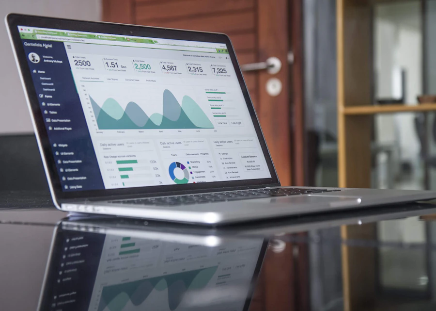
Workforce Dashboard Fluency
Design, critique, and run productivity dashboards that survive executive scrutiny.

Cohort Signal Labs
Segment workforce data so overtime, attrition, and capacity stop looking like one flat average.

Ops Rhythm Studio
Turn platform metrics into a cadence your managers can actually keep.
Why teams stay
Less theatre, more operating clarity
-
Metric definitions that travel
We lock naming, filters, and exclusions so Finance, HR, and Ops stop arguing over three “utilization” numbers.
-
Visual hierarchy with intent
You learn when a heatmap earns screen space — and when a single annotated sparkline is enough.
-
Malaysia-aware delivery
Examples reference regional shift patterns, multi-site teams, and the reporting habits common across Petaling Jaya and KL hubs.
From learners
Voices from recent cohorts
★★★★☆
Solid on cohort comparisons. I still wish the sample workbook covered retail floors better, but the filter logic transferred fine.
Next step
Bring your messy productivity board. Leave with a ritual.
Tell us what platform you use and which workforce metric keeps slipping. We will point you to the right course path.